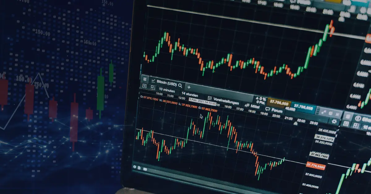
Price movements make the currency market go round. The rise and fall of currency pair prices make or break forex traders’ profits.
For this reason, learning how to read a price chart is a vital skill for anyone wanting to make money from forex trading or become more skilled at technical analysis.
There are many types of forex charts. The most popular types of forex charts are the following:
- line chart
- bar chart
- candlestick chart
However, there are also other forex chart types you can use, such as:
- Heikin-Ashi chart
- Renko chart
- Point and figure chart
In this article, you’ll learn about the different types of forex charts and how to read them.
Visualization of Price Movements on a Forex Chart
Forex charts are visual representations of price movements in the currency market. Whatever form they take, these visual elements help forex traders read forex charts more easily and efficiently.
Every forex chart has its strengths. When conducting technical analysis, you can use varying forex charts for specific purposes.
Whatever price chart you use, they are usually useful for one scenario or another.
For instance, forex traders commonly use line charts to get a basic overview of market movements, while a candlestick chart provides more in-depth insights into market sentiments across different time frames.
Types of Forex Charts
Before learning how to read price charts, you should first have a solid understanding of each type of forex trading chart.
Let’s start with the most common chart types that many forex traders use.
Line Chart
The line chart is the simplest of all forex charts. Traders often use this type of chart to see the general price movement or market condition over a specific period.
Line charts trace the closing price of one period and connect it to the closing price of another, and so on, to paint a picture of the general trend.
By connecting the closing prices of consecutive trading periods, you can follow the movements of the price of a currency pair.
Line charts are helpful if you only want to check the closing price and nothing else. However, its simplicity limits the use of a line chart.
If you’re also interested in knowing about other market elements (e.g., market sentiment, the opening price of currency pairs), you must use other forex trading charts in addition to the line chart.
Bar Chart
Bar charts are a more complex version of line charts.
A bar chart offers more insight into the prevailing price movements. Forex traders also call bar charts “OHLC” charts because they show the opening (O), closing (C), high (H), and low (L) prices of a currency pair.
- Opening – the price level at which a currency pair opened during the time period covered by the bar chart.
- High – the highest price level reached by the price action during the relevant period.
- Low – the lowest price level reached by the currency pair’s prices during the relevant period.
- Closing – the price level at which the currency pair closed during the period.
If you’ve set your chart to a five-minute time frame, the bar chart shows the opening, high, low, and closing price levels within a five-minute interval. In short, it shows the pair’s trading range.
Bar charts are useful if you’re using price action strategies. They let you determine the direction of market movements and give a more detailed overview of periodic price movements.
Candlestick Chart — the Most Popular Chart in the FX Market
The candlestick chart is the most popular type of forex chart.
Just google “Forex charts”, and you’ll likely see that most of the examples in the images section are candlestick charts.
This chart originated in Japan and was not used in the West until the late 1980s. It was developed in Japan during the 17th century by a Japanese rice trader named Munehisa Homma.
Steve Nison, an American analyst, learned the technique and popularized it in the West through his book “Japanese Candlestick Charting Technique.”
You can easily identify candlestick charts by their colored price indicators.
Candlestick and bar charts have certain similarities. Both charts show price movement over specific time frames and each period’s open, high, low, and close prices.
However, candlestick charts provide additional insights into current market conditions that you won’t get from a bar chart, such as:
- Market sentiment
- Highest and lowest price action levels
You can see these data from the color of the candlestick’s body and the presence or absence of “shadows.”
Shadows, or wicks, are vertical lines that can appear above and below the candlestick’s body and indicate the highest and lowest points that the price action reached for that period.
Candlestick charts are so named for being similar in appearance to a candlestick. The main difference between these forex trading charts and the bar chart is its shadows.
There are chart patterns you can use to better identify trends and potential reversals when using candlestick charts.
Examples of these chart patterns include:
Doji
Doji candlestick patterns are formed when uncertainty is the prevailing market sentiment.
During these times, neither buyers nor sellers gain the upper hand. This results in very short candlestick bodies with long shadows.
Dojis form during periods of market consolidations, and technical traders often see them as signals of possible reversals.
However, the appearance of Dojis in candlestick charts is not an absolute indicator of a trend reversal. It’s highly advisable to use them together with other technical analysis tools (e.g., line charts and bar charts) to verify the reliability of the signal.
Morning Star and Evening Star
The morning star and evening star chart patterns are counted among the more complex candlestick chart patterns.
They are both reversal patterns that occur at opposite levels on price charts. The morning star forms at the bottom of a downtrend, while the evening star appears at the top of an uptrend.
A morning star can have either hollow or filled candlesticks, representing bullish or bearish sentiment, respectively. It is formed by three candlesticks, where the middle candlestick forms the “star.”
The first of the three candlesticks shows the continuing downtrend. The middle star shows the market consolidation period. Finally, the last candlestick shows the bullish investors winning and the start of a trend reversal.
In contrast, an evening star is a bearish reversal candlestick pattern. It consists of three candles: one large bullish candle, followed by a small-bodied middle candle(the star), and a bearish candle.
The pattern shows an uptrend (the first bullish candle), which turns into a consolidation period (the small-bodied middle candle) that ultimately becomes a downtrend (the third bearish candle).
Hammer and Hanging Man
The hammer and the hanging man patterns are a nearly identical type of candlestick formation. Both of these forex chart patterns have small-bodied candles with elongated lower shadows.
Hammer candlesticks appear during downtrends. They form at the bottom of the trend and typically signal the start of a bullish reversal.
Conversely, the hanging man pattern forms during uptrends and appears near the resistance level. The formation of a hanging man generally means that the market is about to turn bearish.
In both cases, the candlestick’s color is largely irrelevant. However, a hanging man with a black or filled candlestick marks an even more bearish market than one with a white or hollow candlestick.
Shooting Star and Inverted Hammer
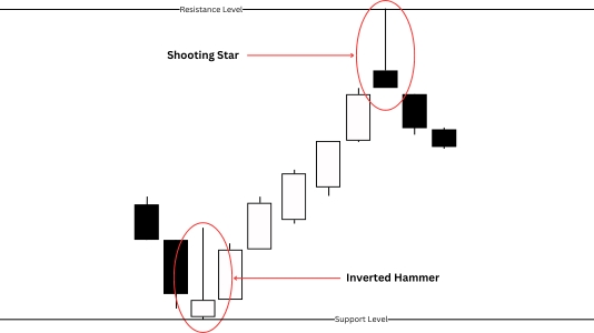
Another set of similar candlestick patterns is the shooting star and inverted hammer. Like the hammer and hanging man patterns, the only difference between a shooting star and an inverted hammer pattern is whether the market is in a downtrend or an uptrend.
Both patterns have short bodies with long upper shadows.
Inverted hammers are bullish reversal patterns that typically form near the support levels during a downtrend. This candlestick generally indicates that buyers have gained the upper hand in the market and that asset prices are about to rise.
On the other hand, a shooting star pattern’s appearance in a forex chart likely foretells the start of a bearish reversal.
This pattern occurs during uptrends and often forms near the resistance levels. A shooting star’s long upper shadow indicates that buyers have tried to continue the upward price rally but failed. Closing prices near the period’s opening price show that sellers have taken control of the market.
Engulfing Patterns
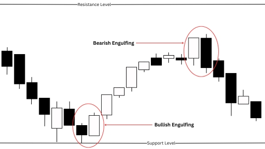
Engulfing patterns are dual-candlestick patterns; that is, the patterns include two adjacent candlesticks instead of just one.
These forex chart patterns got their name because one of the two candlesticks always completely covers, or “engulfs,” the other.
There are two types of engulfing candlestick patterns:
- Bullish engulfing pattern
- Bearish engulfing pattern
Bullish Engulfing Pattern
This pattern is characterized by a filled (bearish) candlestick followed by a larger (bullish) hollow one. The appearance of a bullish engulfing pattern in a downward trend is a strong signal that the trend is about to reverse.
Bearish Engulfing Pattern
A bearish engulfing pattern occurs in an uptrend and is formed when a hollow (bullish) candlestick is followed by a larger filled (bearish) one. The formation of this pattern in an uptrend is a strong indicator that sellers have taken over the market, and the uptrend is about to become a downtrend.
How to Read Different Types of Forex Charts
Once you become familiar with forex trading charts, interpreting the data can be easy. Whether you’re reading line charts, point-and-figure charts, or other chart types, knowing what each part signifies is crucial.
How to Read a Line Chart
Line charts are perhaps the easiest forex trading charts to interpret, as they only involve the movement of a single line across a specific trading period.
Here’s how you can read line charts:
- Line charts have two axes, the X- and Y-axes.
- The X-axis is the horizontal line (usually) at the bottom of the chart that represents the trading period. Each increment on the X-axis represents a minute, an hour, and so on.
- The Y-axis, the vertical bar on the right side of the chart on a forex trading platform, represents the price or value of an asset. The higher the position on the Y-axis, the bigger the value represented.
- The line on the chart represents different closing prices for each period. A line sloping upwards represents an uptrend, while a downward slope indicates a downtrend.
How to Read a Bar Chart
Bar charts are more complex than line charts and can show you a more nuanced understanding of market dynamics.
Here’s how you can interpret data from bar charts:
- Bar charts consist of four main components: open, high, low, and close.
- The “open” is represented by a horizontal line pointing to the left, indicating the price at which the period opened.
- The “close” is another horizontal line pointing to the right, connected to the vertical line, and represents the closing price.
- The vertical line shows the asset’s highest and lowest prices for the period, with the top end indicating the highest point and the bottom indicating the lowest.
- The size of the bars, which encompass the entire structure, including the vertical line and the horizontal bars representing open and close, can vary based on market volatility.
How to Read a Candlestick Chart
Candlestick charts are trickier, as there are different patterns that can be interpreted differently.
Here’s how you can interpret pricing data from a candlestick chart:
- Each candlestick represents a specific trading period and consists of a body and wicks (or shadows).
- The bottom end of a candlestick indicates the period’s opening price, while the top half indicates the closing price. The upper and lower shadows show the highest and lowest prices paid during the period.
- If a candlestick’s body is filled (colored in), it means that bears are dominant during the covered period. If it is hollow (no color), then bulls control the market during that period.
- Candlesticks can vary in length, depending on the market volatility during the period they cover.
Final Thoughts
Knowing how to read different types of forex charts is a vital skill for all traders.
Charts are effective tools when conducting technical analysis. They can give you valuable market insights, which you can use to predict the future price movement of assets.
This can help you gain a deeper understanding of market dynamics and how investors’ sentiments affect the ebb and flow of prices.
If you’re interested in learning more about technical analysis and the forex market, check out our other blogs!

